Raise your hands if you want to maximize your ad revenue! 🙋🏻♀️🙋🏽♂️
Well, you’re in luck! ‘Cause today our in-house AdOps expert, Germán Tinaut Serrano, has let us in on a very easy revenue boosting tactic any publisher could do (we believe in you!). One step to improve your ad strategy is to be very mindful when it comes to choosing the best spots for ad placement.
If you want to become a GrandMaster of ad placement, keep reading to learn the key methods for optimizing ad inventory allocation and focusing on maximizing viewability and revenue, while maintaining a positive user experience.
Let’s dive in!
1. Prioritize Viewability
In the advertising world, viewability is a metric that indicates the number of impressions where 50% of the creative has been in the viewport for at least 1 second. This is important because it tells you if the ad is in a spot good enough for a user to see. An impression needs to be on the screen for it to be able to impact someone, so if it’s not viewable it can’t. In other words: you have to make ad viewability a top priority.
Before your head goes kaput trying to figure out the best ways to prioritize viewability. Let us share some tips from our expert, Germán, on how you can do it:
A. Put quality over quantity:
“It’s more effective to have fewer ads on premium positions than multiple in poor placements” – recommends Germán.
For example, after the first paragraph the banner can generate more revenue than 3 of them placed in a poor position. Poor positions are those that will not catch the attention of the user such as long categories pages, in between articles without any content surrounded or at the very bottom of the website. Avoid these spots and you are good to go (don’t say we didn’t warn you!).
B. Place your ads strategically:
Placing ads in high viewable areas not only maximizes revenue but also improves user experience by minimizing distractions. For this you have to find THAT optimal location. High viewable areas are those hotspots, like the comments sections, the first 3 paragraphs of an article or near a video content, where users stay longer due to the content.
“A high position on the page DOES NOT strictly means high viewability. While the top of the page is a highly viewable spot, ads placed here might be missed as users tend to scroll down to the content quickly”.
Try positioning ads within the content. It’s a much better practice because the ad would have more chances to be seen while the reader is scanning the content. Do this and you’ll thank us later 😉
C. Spot the eye-catching zones:
Place ads in sections that drive users attention, such as near engaging content or headlines. Put yourself in your audience’s shoes. Think as if you were a user trying to escape from ads and ask yourself, where would you look?
2. Implement sticky ads
You can increase viewability by using sticky ads. Sticky ads are a type of ad format that remains viewable while users scroll through the page. This can significantly boost the number of ads seen thanks to the refresh applied, which turns into more profitability (sweet! 🤑).
There are 4 kinds of sticky ads
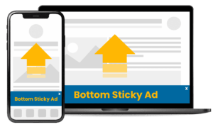
Bottom horizontal sticky ad (Mobile3& Desktop): These ads are placed at the bottom of the website and remain visible while the user keeps scrolling.
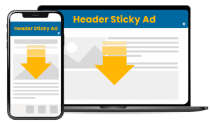
Header horizontal sticky ad. (Mobile & Desktop): This one is typically placed at the top of the website and sticks to the top part of the screen as the user scrolls down.
Sidebar sticky ads. (Desktop): This ad is placed at the sides of the page. Normally in article pages, and remains fixed while the user navigates through the content.

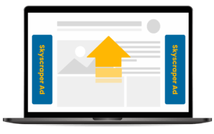
Skyscrapers. (Desktop): Skyscrapers are placed vertically at each of the sides of the website, divided per width of screen to show 160px width or 300px width.
3. Reserve space for ads
There is one thing absolutely NO ONE wants in their websites and that is layout shifts. These occur when the elements we see on screen move positions unintended (a literal pain in the ass). This can lead to a high Cumulative Layout Shift score, which is one of the core vitals that influences your SEO ranking on Google’s SERPs.
To avoid layout shift from happening, we propose you reserve the space of the height of the ad, even though this might be disruptive for users. This is also good practice to follow, as it will prevent shifts on your page and improve user experience.
Make ads sticky in reserved space
To avoid sticky situations (pun not intended) like layout shifts, improve viewability for ads, and increase the viewable time, we propose you reserve a bigger space than the actual size of the ad. This will make the ad sticky for the reserved space. This will bring more revenue without major change from your side.
4. Maximize competitiveness with flexible ad sizes
Try implementing a variety of ad sizes on your web. For reference, you could check some of these Ad Formats to match your site’s needs or these high value ad formats advertisers would splurge on!
“Limiting the sizes of ads reduces the competition among advertisers leading to lower CPMs” – says our expert.
To avoid risking getting low CPMs, allow a wide range of sizes so you can increase competition and fill-rate, thus, revenue.
For example, where you allow a 300×600 banner, you can allow other smaller formats to compete in the bidding process. In this case a 300×250, 160×600, 120×600 and 300×100 could all also bid for the same space. Due to the Real-Time-Bidding process in Prebid the highest bidding banner will win the impressions.
Place your ads smarter, not harder
Identifying and understanding the key spots for ad placement on your site for the ad units is a one way ticket to improving your chances of scoring a much higher revenue. Big time!
To wrap things up. Prioritize viewability choosing the high quality hotspot of your website, use the perfect ad formats for your page, and don’t mess with your user experience (you’ve been warned!).
Who says placing ads has to be complicated? If you are still curious about more of the sweet secrets to optimize your ad placement strategy get in touch with our AdOps experts at Refinery89! We are just one message away!


